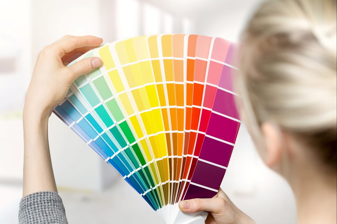
 You've probably heard at one point or another that certain colours can convey certain feelings. Whether you believe this or not, it's an interesting topic to consider! Here's our take on how colours can affect your mood.
Yellow This colour tends to cause eye fatigue, more than any other colour. It's also been shown to upset babies! In adults, it tends to increase metabolism. There are some conflicting reports, however. Some say yellow causes people to lose their temper more often, but then others say it makes people feel cheerful and happy. Seems like a very polarizing colour! You'll find the softer shades of yellow are easier to live with than bright, canary yellows. The shade range in yellow is very large, and some are better suited for interior paint designs than others. Ultimately, yellow prompts opinionated feelings, more so than other colours. Those who like it, really love it, while those who don't, tend to strongly dislike the colour in a residential interior painting project. Pink This is an interesting colour. It is mainly associated with females and being feminine, but it can go further than that. There is research data that shows rooms painted in pink tend to reduce aggressive, angry behaviour, at least on a temporary basis. These studies were conducted at prisons, where various cells were painted in pink and then the behaviour of inmates observed afterwards. The cells painted in pink did in fact have less violent behaviour than the regular cells. Pink is a true favourite for painting a baby's room. It has comforting appeal to a baby, male and females alike. It's also a great choice for a young child's room and works very well with lavender shades. Brown The colour brown is all about security and reassurance. It also tends to be comfortable. Browns hold up well over time and are an excellent choice for rooms that get a lot of use. Shades of brown work well with other warm colours. The shade range of browns spans broadly and contains many neutrals. You could theoretically make some shade of brown work for any room! Furthermore, you can create exciting designs by incorporating unexpected tones in with the browns, like fuchsia and light blues. Play around with this and see what sophisticated interior paint designs you can come up with! Grey The colour of grey has been shown to increase creativity. It makes a great colour for studios or a home office. Grey is also ideally suited as an "executive colour." Since grey is truly a neutral colour, in all shades, it provides an excellent background for a very large number of colour combinations. Greys often last a very long time on walls and they provide a great background to make your beautiful furniture pop. A very stylish living room/family room trend is a shade of grey on the walls with unique furniture and area rugs. Shades of grey are very flexible, covering a wide range of styles, from traditional to contemporary. Stay tuned for part 2 of this article where we'll explore more colours!
1 Comment
|
ArchivesCategories
All
|
 RSS Feed